I am one of those people that knows what they want. So, coming up with a logo, client packaging, marketing material, etc. should have been incredibly easy for me. However, this was not the case. Apparently, the products I had created in my head did not exist or at the very least I could not find them. After hours scouring every website with the word ribbon and every site mentioned for packaging by NAPCP and WPPI, I was about ready to give up or pull my hair out.
Instead, I walked away and tried my hardest not to think about how I want to present myself to clients. For someone who is a constant overthinker, this was not an easy task. That night I sat down and ordered a rubber stamp (rubberstamps.net) with my logo on it. It was the smartest move I have made thus far. Well, aside from having the wonderfully talented, Dan Gilkey put together my logo. I wanted to have my business identify with words such as organic and fresh, but without having to actually use those words. Using the rubber stamp solidifies my identity even more. It takes care, time, and patience every time you use the stamp.  This is another thing I want to have come across when people think of my child photography experience as a whole.
Once I got the stamp in the mail, I ran off to Paper Source to get inspired and figure out my client packaging. By the time I left Paper Source, I had it all figured out from the wrapping of the prints (chocolate brown tissue paper) to the wrapping of the albums (beautiful green satin ribbon) to the final paperwork (chocolate brown envelope, cream letterpress paper placecards [for thank you notes] and a simple sticker to seal the deal) – Notecard advising about print/album care, Final Thank You Note, stickers :). Oh, I forgot about the kid stamps I got for the outside of the envelope. They really don’t serve a purpose, but they are fun and they look pretty gorgeous in white ink against the chocolate envelopes. I also created some super cool vinyl stickers that are of a similar theme to the Design Aglow template I used for my information booklet.
As a final touch, every backside of the mat board is stamped in chocolate ink with my logo (acid-free ink).
I guess my whole point in writing this is for those of us that are in the very early stages of a new business who are trying to present themselves memorably and accurately. For those of you who are at that place, all you need to do is figure out who you are as a business. Come up with 5 to 10 words that describe your work, and I will bet that you can come up with a color scheme and package ideas from those words alone.
I’ll post photos of album packaging and print packaging in the next few weeks, once I have the stickers, albums, and prints 🙂
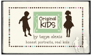
vinyl sticker – mockup
new stamp
mat boards / back of prints

final package envelope for clients with boys
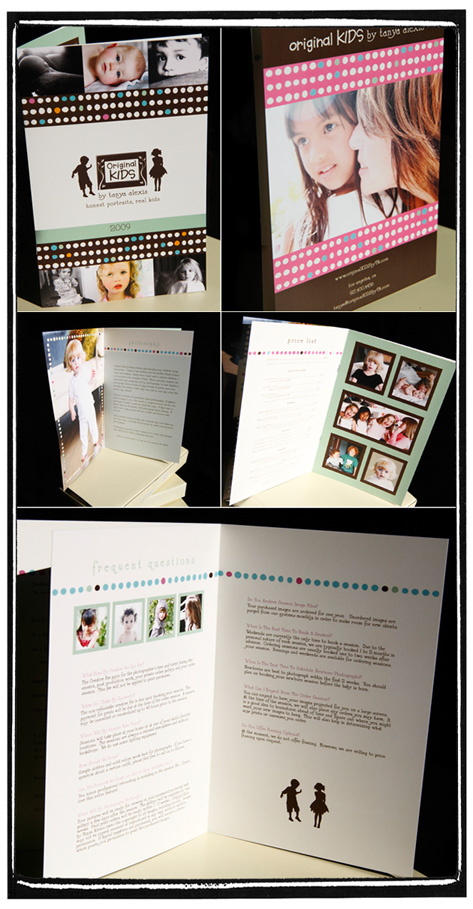
Information Booklet (Beautifully Printed by CopyCraft.com)
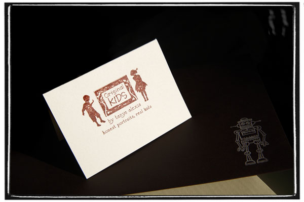
Final Thank You Card


